


この記事でわかること
- 第一回のデータを基に、データとグラフを作成、保存します。
- アセットアロケーション
- 各銘柄の損益率
- アセットごとの時系列データ
- 元本と含み益の時系列データ
- 私はプログラマではないので動けば良いという考えです。
第一回 pythonでマネーフォワードアクセス&データ抽出
あわせて読みたい


マネーフォワードのPythonスクレイピング(1)
この記事でわかること マネーフォワードの資産データを、pythonのseleniumライブラリで収集します。 私はプログラマではないので、動けば良いという考えです! 【Python…
目次
Pythonコード
第一回で読み込んでいるライブラリ
from selenium import webdriver
from selenium.webdriver.common.by import By
from webdriver_manager.chrome import ChromeDriverManager #追加
from time import sleep
import os
import subprocess
import re
import datetime
import pandas as pd
import matplotlib.pyplot as plt
plt.rcParams['font.family'] = "Meiryo"
import numpy as np
第一回の続きのコード
#アセットごとに合計
df_alloc = pd.DataFrame(df.groupby("asset_type").sum()["value_vl"])

# アセットアロケーション
fig = plt.figure()
df_alloc["value_vl"].plot.pie(autopct='%1.1f%%',startangle=90,counterclock=False)
filename2 = "./daily_asset/" + datetime.date.today().strftime("%Y%m%d") + "_asset_allocation.png"
fig.savefig(filename2, dpi=300)


#各ファンドの損益率
df_plratio = df.copy(deep=True)
# Noneと現金を除く
df_plratio =df_plratio.query('asset_type != [None, "cash"]')
df_plratio["Profit_and_loss_ratio"] = df_plratio['value_pl']/df_plratio['value_vl']*100
df_plratio=df_plratio.set_index('name')

plt.figure()
color = [('skyblue' if i > 0 else 'orange') for i in df_plratio["Profit_and_loss_ratio"]]
df_plratio["Profit_and_loss_ratio"].plot.bar(color=color,  xlabel="",ylabel="損益率(%)")
filename2 = "./daily_asset/" + datetime.date.today().strftime("%Y%m%d") + "_profit_loss.png"
plt.savefig(filename2, dpi=600)


#時系列データ(評価額)
today = datetime.date.today().strftime("%Y-%m-%d")
df_tmp_vl = pd.DataFrame(df.groupby("asset_type").sum()["value_vl"])
df_tmp_vl.index = df_tmp_vl.index +"_vl"
df_tmp_pl = pd.DataFrame(df.groupby("asset_type").sum()["value_pl"])
df_tmp_pl.index = df_tmp_pl.index +"_pl"
total_pl = df_tmp_pl["value_pl"].sum()
total_vl = df_tmp_vl["value_vl"].sum()
total_Principal = total_vl -total_pl -df_tmp_vl["value_vl"]["cash_vl"]

df_tmp_pr = pd.DataFrame({"value_vl": [total_Principal,total_pl]}, index=["Principal", "Profit"])
df_tmp_vl = pd.concat([df_tmp_vl, df_tmp_pr])
df_tmp_vl = df_tmp_vl.rename(columns={'value_vl': today})
df_tmp_pl = df_tmp_pl.rename(columns={'value_pl': today})
df_today = pd.concat([df_tmp_pl, df_tmp_vl]).T


#これまでのデータを読む
df_t = pd.read_csv( "./time_series/time_series.csv",index_col=[0])#,index_col="date")
today = datetime.date.today().strftime("%Y-%m-%d")
# 記録データへ追加する。
df_t=pd.concat([df_t, df_today])
# 時系列データへ
df_t.index= pd.to_datetime(df_t.index)
# データの上書き。
filename1 =  "./time_series/time_series.csv"
df_t.to_csv(filename1)

# 時系列データ アセットごと
df_t.index= pd.to_datetime(df_t.index)
plt.figure()
df_t_v = df_t.filter(regex='_vl$').filter(regex='^(?!cash)')
df_t_v.plot.area()
filename2 = "./daily_asset/" + datetime.date.today().strftime("%Y%m%d") + "_asset_timeseries.png"
plt.savefig(filename2, dpi=600)

# 時系列データ 損益
plt.figure()
df_t.plot.area(y=['Principal','Profit'])
filename2 = "./daily_asset/" + datetime.date.today().strftime("%Y%m%d") + "_PL_timeseries.png"
plt.savefig(filename2, dpi=600)
解説
第一回の時点でマネーフォワードのデータをdataframeにしているので、あとは好きにして下さい。
ここでは例としてデータ整理と可視化を何パターンかします!
- アセットアロケーションごとの合計
- 銘柄ごとの損益
- 時系列データとしてテキストに蓄積 → 変化を可視化
アセットアロケーション
#アセットごとに合計
df_alloc = pd.DataFrame(df.groupby("asset_type").sum()["value_vl"])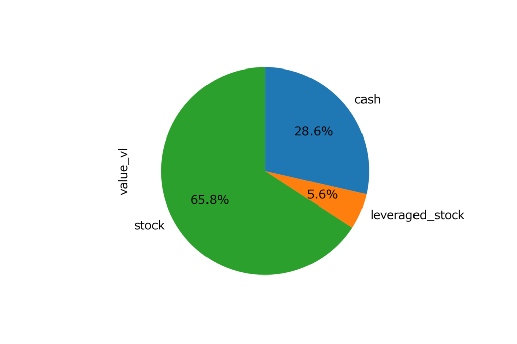
各銘柄の損益率
df_plratio = df.copy(deep=True)
# Noneと現金を除く
df_plratio =df_plratio.query('asset_type != [None, "cash"]')
df_plratio["Profit_and_loss_ratio"] = df_plratio['value_pl']/df_plratio['value_vl']*100
df_plratio=df_plratio.set_index('name')
df_plratio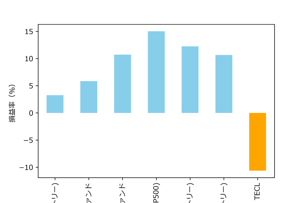
アセットごとの時系列データ
- 今日の分のデータを損益率と元本をまとめ直しています。
today = datetime.date.today().strftime("%Y-%m-%d")

df_tmp_vl = pd.DataFrame(df.groupby("asset_type").sum()["value_vl"])
df_tmp_vl.index = df_tmp_vl.index +"_vl"
df_tmp_pl = pd.DataFrame(df.groupby("asset_type").sum()["value_pl"])
df_tmp_pl.index = df_tmp_pl.index +"_pl"
total_pl = df_tmp_pl["value_pl"].sum()
total_vl = df_tmp_vl["value_vl"].sum()
total_Principal = total_vl -total_pl -df_tmp_vl["value_vl"]["cash_vl"]

df_tmp_pr = pd.DataFrame({"value_vl": [total_Principal,total_pl]}, index=["Principal", "Profit"])

df_tmp_vl = pd.concat([df_tmp_vl, df_tmp_pr])
df_tmp_vl = df_tmp_vl.rename(columns={'value_vl': today})
df_tmp_pl = df_tmp_pl.rename(columns={'value_pl': today})
df_today = pd.concat([df_tmp_pl, df_tmp_vl]).T

#これまでのデータを読む
df_t = pd.read_csv( "./time_series/time_series.csv",index_col=[0])#,index_col="date")
today = datetime.date.today().strftime("%Y-%m-%d")

# # 記録データへ追加する。
df_t=pd.concat([df_t, df_today])
# #時系列データへ
df_t.index= pd.to_datetime(df_t.index)
コードと同じフォルダにtime_seriesというフォルダを作成し、そこにあるtime_series.csvから読み出し、書き出しをします。こんな感じのものを用意しておけばOKです。
,cash_vl,bond_pl,bond_vl,cash_pl,leveraged_stock_pl,leveraged_stock_vl,reit_pl,reit_vl,stock_pl,stock_vl,Principal,Profitまとめ
第一回で準備したリストを基に、アセットアロケーション、各銘柄の損益率、およびアセットごと・元本と含み益の時系列データを可視化しました。


コメント